*Press sample
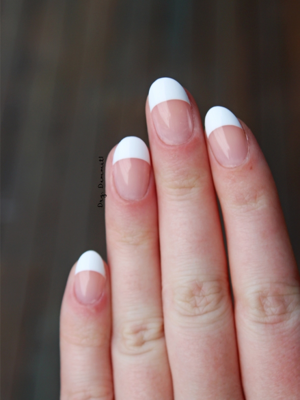
I’ve never tried false nails before, so when I was approached by Key Sun to try out some of its KISS brand false nails, I was excited to try them. I guess I’d always thought they’d just be a nightmare to apply and uncomfortable to wear. I’m not sure where I got that idea from – most likely my own self-talk – but I decided I’d keep an open mind. Read on for my experience with KISS Salon Acrylic French false nails.

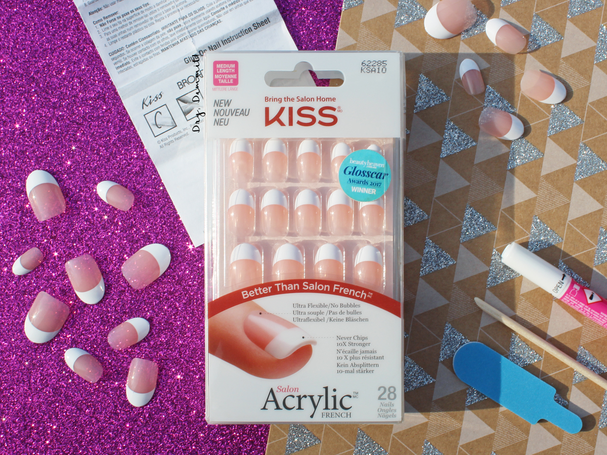
What you get in the pack is comprehensive, in fact, you don’t need to use any other tools if you don’t really want to (the ony exception is acetone to wipe oils off your nails before adding the glue and also to remove the nails BUT I reckon if you didn’t do the former it wouldn’t be a big deal). Included in the pack of KISS Salon Acrylic French were 28 nails in 14 sizes, nail glue, a nail file, a cuticle pusher and an instruction pamphlet. The nails I received were in medium length and oval shaped. Looking at the other KISS products, you can get shorter nails and ones in different shapes, like square. I probably would’ve prefered the square nails on me (as oval nails are so far from what I’m used to and it seemed like that made it more obvious they were fake) but I’m glad I tried something out of my comfort zone nonetheless.
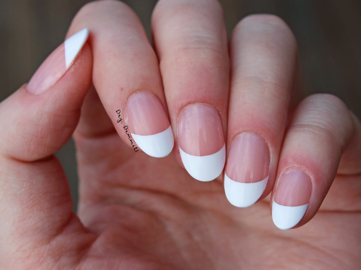
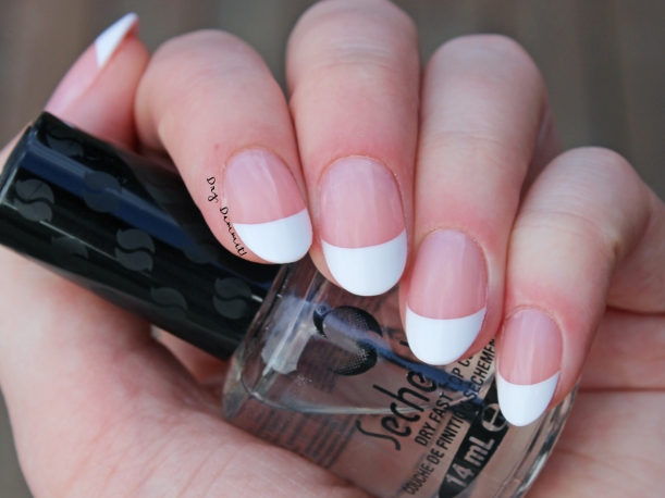
 Just after applying KISS Salon Acrylic French false nails.
Applying the nails was incredibly easy, but I was incredibly slow. This doesn’t help when applying false nails – so remember that! Speed is the key but the only way to get faster is to practice and the only way to practice is to apply the nails, so it’s a vicious circle. I managed to get all on with only my middle finger looking obviously wonky, but it wasn’t too noticeable. The instructions are easy to understand and the longest part of the process was choosing which nails best suited my fingers. I decided to choose the nails beforehand instead of per each finger; I just thought it would be easier that way. The instructions said you could use the nail file to trim the false nails to the right size if need be, but I didn’t do this. Once my nails were chosen, it was pretty much add glue to the false nail, add glue to my real nail and press the false nail onto my real nail starting from the cuticle. I held it for a few seconds but the glue was so quick drying that I’m sure it didn’t need it. I did manage to get glue all over my fingers a couple of times though (I had to get my hubby to apply acetone to dissolve it), hence why speed and precision is your friend. Once the nails were on, I filed the tips to remove the stub I believe the nails were attached to during their making. The acrylic was easy to file and you didn’t need to press hard or be overly vigorous to remove the unwanted bits.
 Just after applying KISS Salon Acrylic French false nails.
 Just after applying KISS Salon Acrylic French false nails.
I did notice on some of the nails I had a little bubbling – the pack claims the nails are “no bubbles” – so either that’s false or it was user error. Probably me, given I had a hard time with that super quick drying glue! All in all, once the nails were on I was pretty happy with how they looked. They were sleek and bright. Not bright as in being close to neon, but bright in that the white tip was so white. When I do French nails I’ll usually add a sheer nude over the tip so the tip isn’t so obviously white, so it was weird to have these stark white tips looking at me whenever I looked at my hands. But that’s just my personal preference. Also, the instructions said to apply a top coat of polish to the nails once they were on, which I did (I used Seche Vite), but I’m not sure why this is recommended. By the end of the first full day of wear the top coat was peeling from the nails. I did add more top coat, but by the second full day when more started peeling (I can’t help it! I’m a picker!) I just wiped acetone over all the false nails and went sans top coat. To me it looked much better. In my 10 days of wear, the false nails didn’t seem to get scuffed/scratched/ruined at all because of a lack of top coat.
One odd thing I noticed one my first full day of wearing the false nails is that my nails hurt. Not all, maybe two or three on each hand, but for a few hours there was some slight pain that I’m not sure how describe. Obviously it wasn’t that bad that I felt like I needed to remove the false nails, but it was uncomfortable. And as suddenly as it came it just stopped, so I’m still not 100% sure if it was only a coincidence that I was wearing the nails or if the nails were causing it. One thing I thought is that maybe the false nails were “stretching” (for lack of better word) the skin around the false nail because the nails were very slightly wider than my nail bed… but I really have no idea. Also, the instructions advise to not wear beyond 10 days but it doesn’t say why. I wore the nails for 10 days with no problems and so felt sad that I’d have to remove them as I thought if you were on holidays or something they might be a good way to have your nails done without any maintenance, but 10 days isn’t even a fortnight! Still, I figured it better to be safe than sorry so removed them on the tenth day of wear.
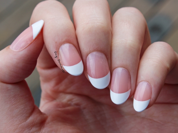 Day 10 of wearing KISS Salon Acrylic French false nails.
Now, removal. I found it really difficult. Even though the instructions say “do not force or pull nails off” I found I had to do a bit of that because they just wouldn’t budge otherwise! And this was even after trimming and filing the surface to get through the top of the false nails. Perhaps I just didn’t wait long enough when soaking in acetone though. But the wait time for their removal seemed to take ages, even longer than when removing glitter polish. When I did manage to finally get the nails off, my real nails were slightly damaged. The top layers of some nails had peeled off with the false nails, leaving noticeable indentations that needed to be filed. It wasn’t a massacre, but it wasn’t pretty either so I’ll use a ridge-filling base coat for a little while. I think the takeaway message here is to soak, soak, soak your nails for as long as possible and then remove. And if you were hoping to keep some false nails to reuse later, well, acetone takes care of that for you. Pretty much the nails shrivel up and they are definitely not reusable.
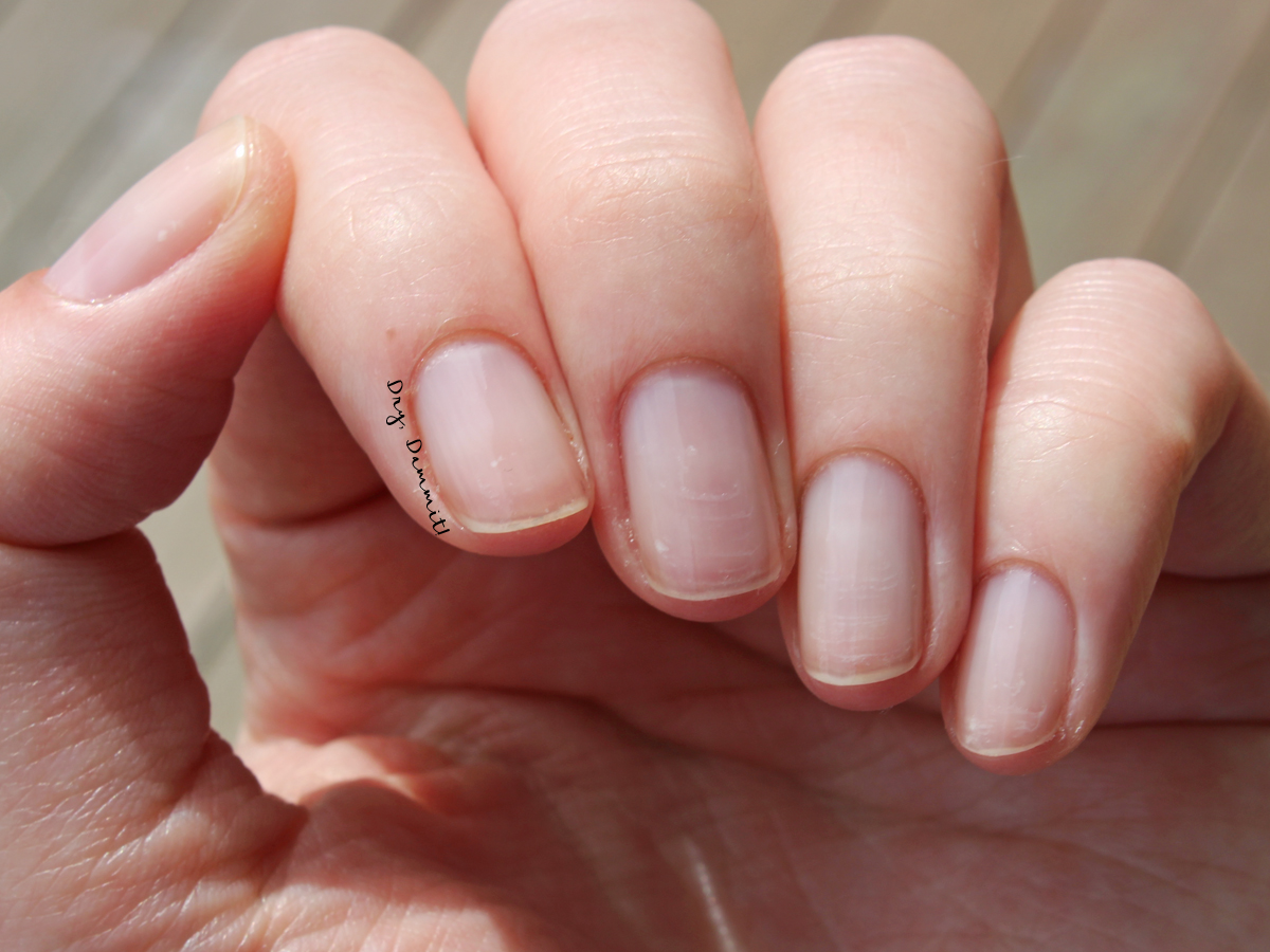
 My natural nails after removal. You can see a bit of damage close to the tips of my nails.
DETAILS
- Where to buy: Key Sun, Big W or Priceline
- Cost: AU$15.99
- What you get: 28 nails in 14 sizes, nail glue, a nail file, a cuticle pusher and an instruction pamphlet
I quite enjoyed wearing the KISS Salon Acrylic French false nails. During my 10 days of wear I had no problems, it was really the application and removal that caught me up, but I reckon now I know what I’m doing it’ll be much easier next time. I’d like to find out why it’s not recommended to wear the nails beyond 10 days; actually, I’ll email Key Sun to ask and then add the reply to this post. Because the real downside to these nails are the limited wear time. EDIT: I received a reply from Key Sun and was told the 10-day wear time is a “precaution as the chemicals from the glue can make some people’s nails weaker the longer they have been exposed to them – others can endure for longer periods. It really depends on your nail health and strength”. So it sounds like you can wear the nails longer; you just need to take into account the health of your nails. The wearing of the nails is really enjoyable and because there’s so many nails, you can at least get two wears out of each pack (maybe some filing needed on the second go). What do you think? Have you tried false nails before? If you have any questions or want to know anything else about wearing them, feel free to ask below. Thanks for reading!
Follow me on Instagram | Pinterest | Bloglovin’
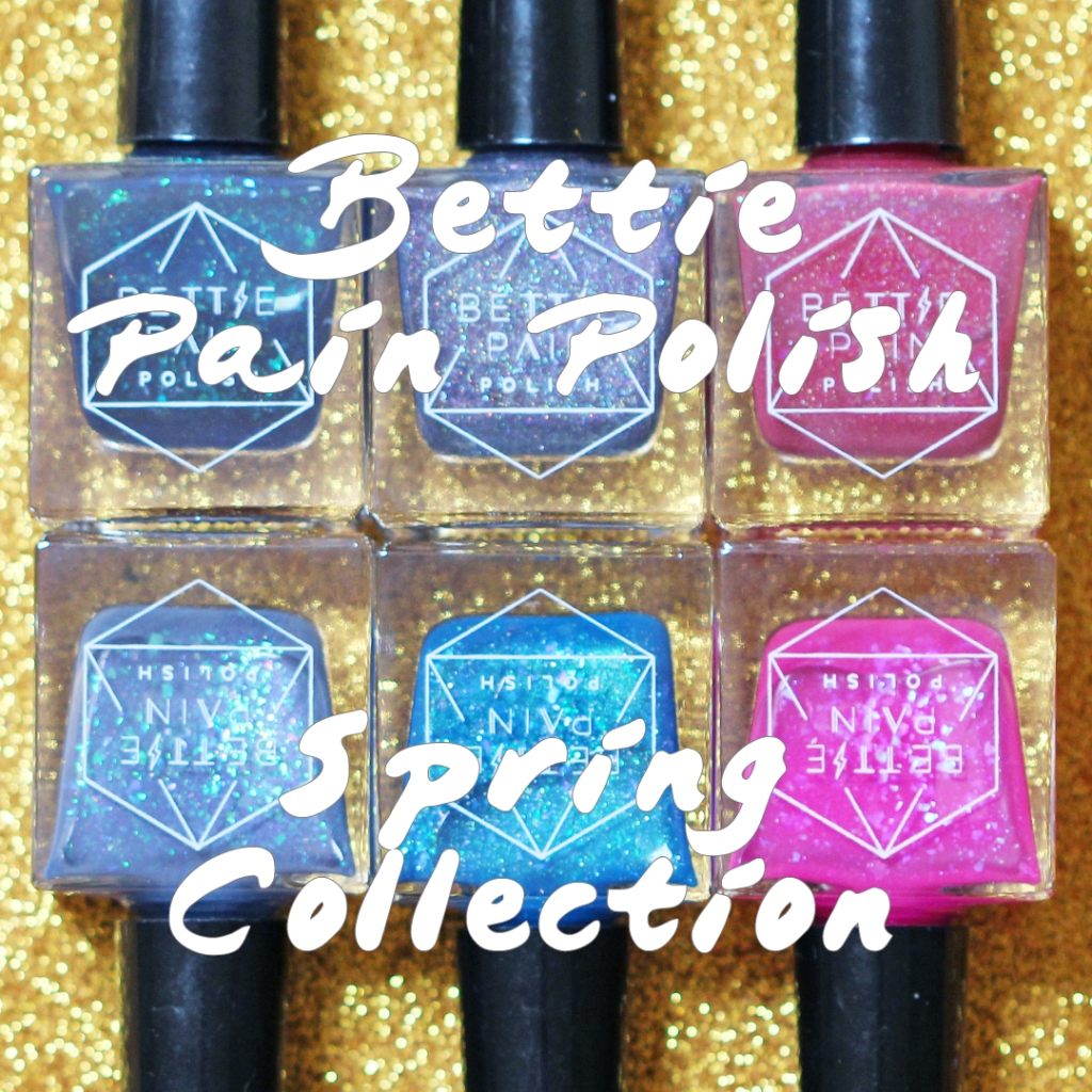
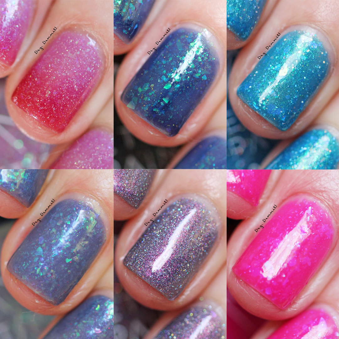
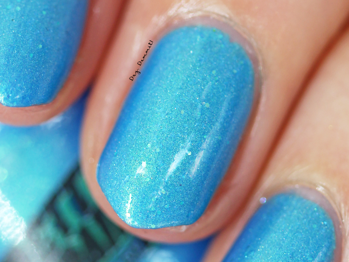
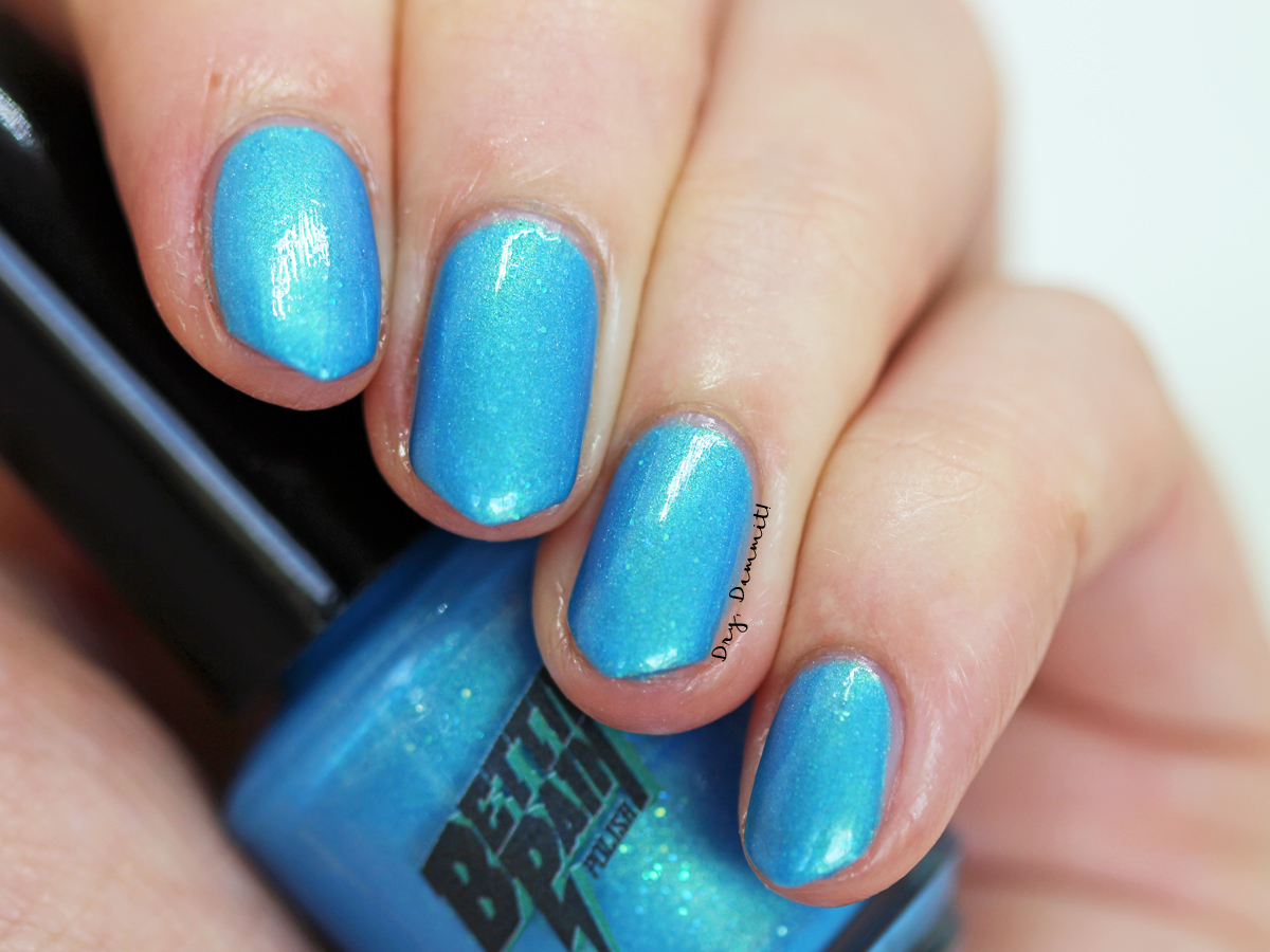
 JET STREAM
 NEON GRAVEYARD
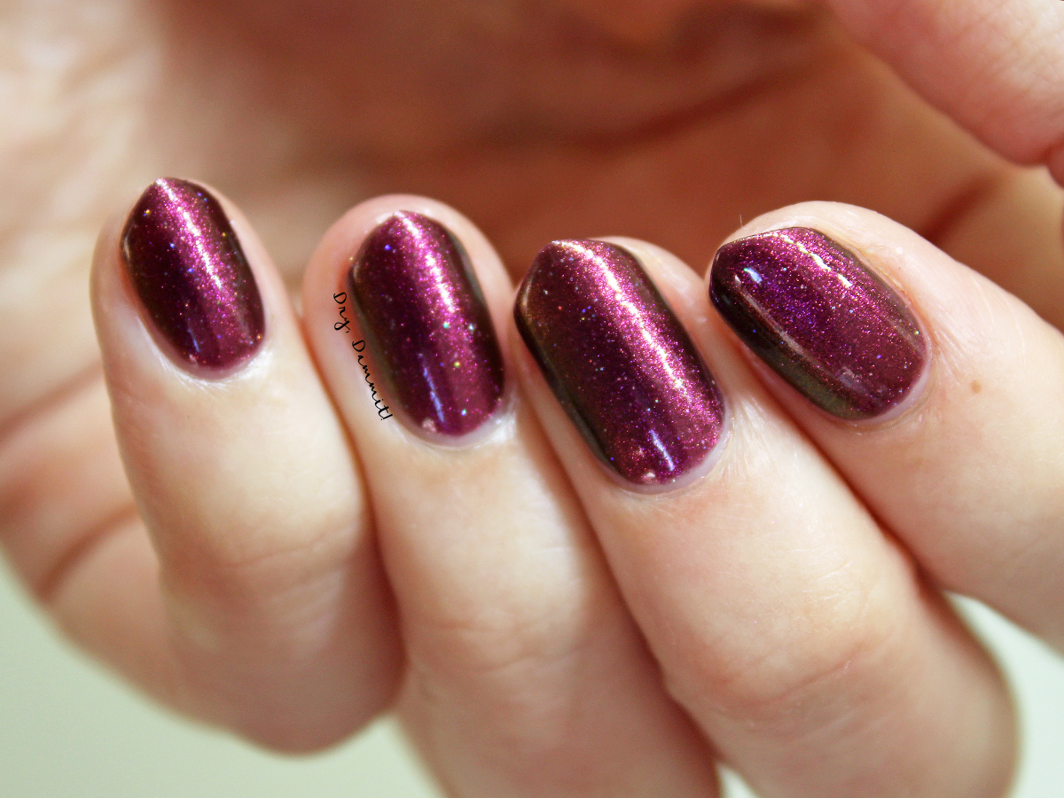
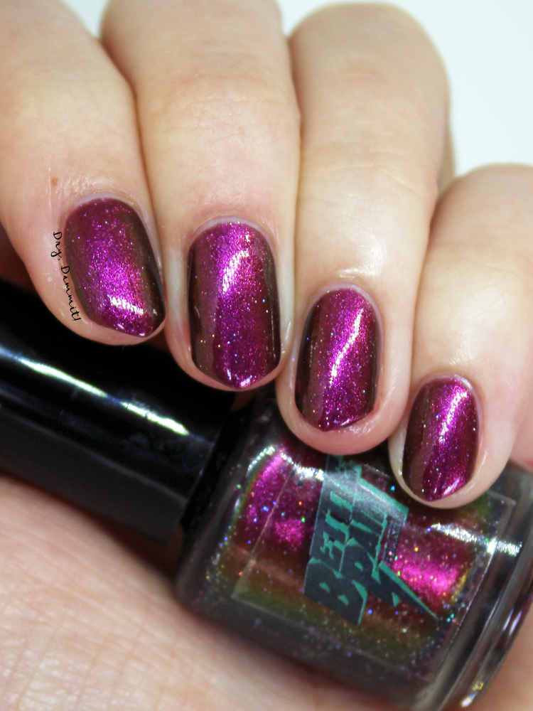
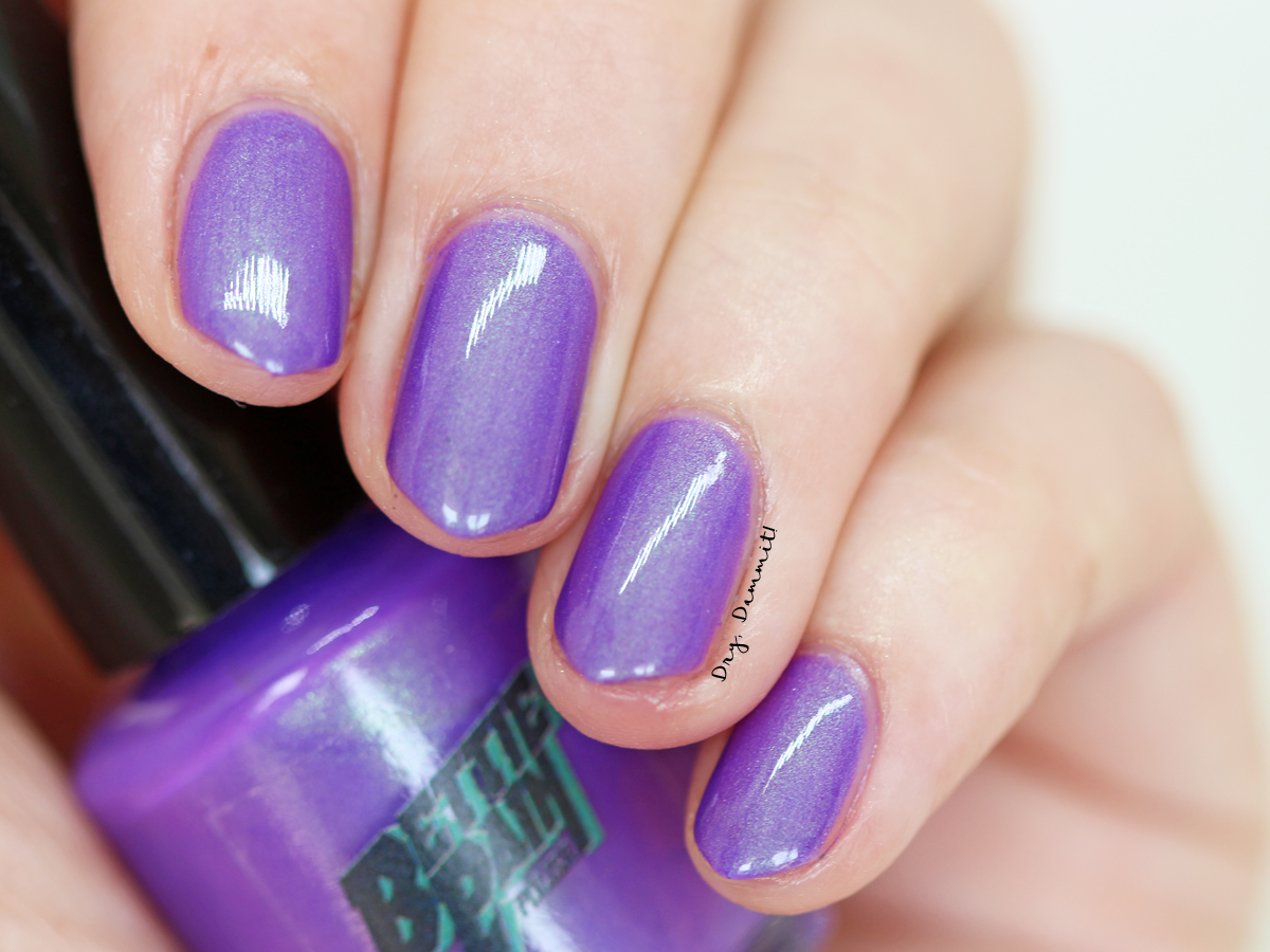
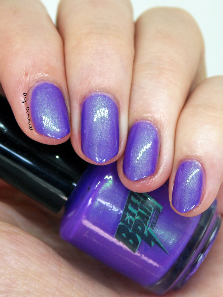
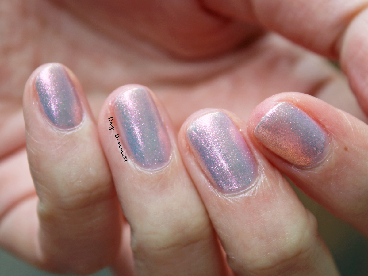
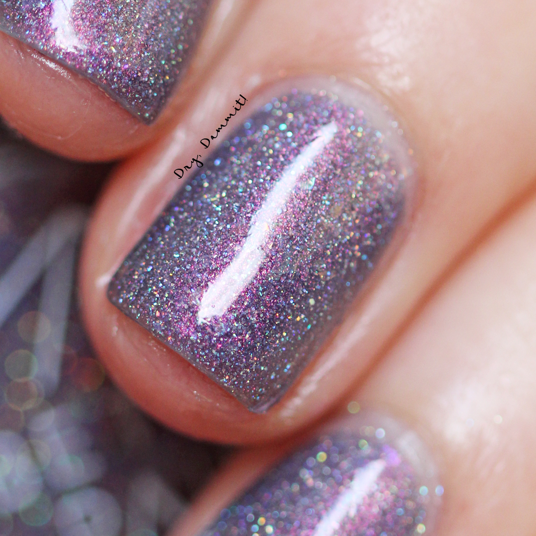
 ENIGMA
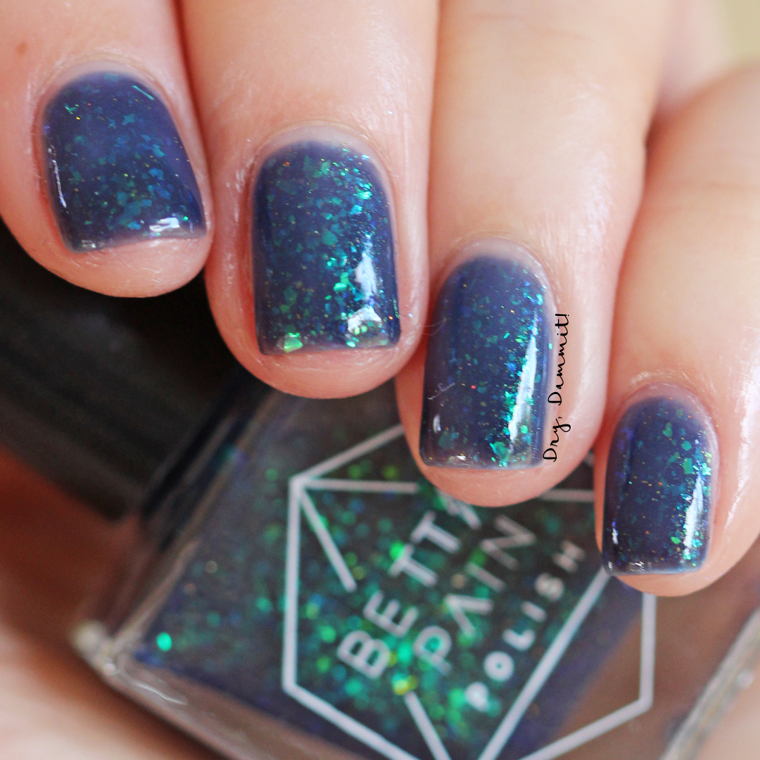
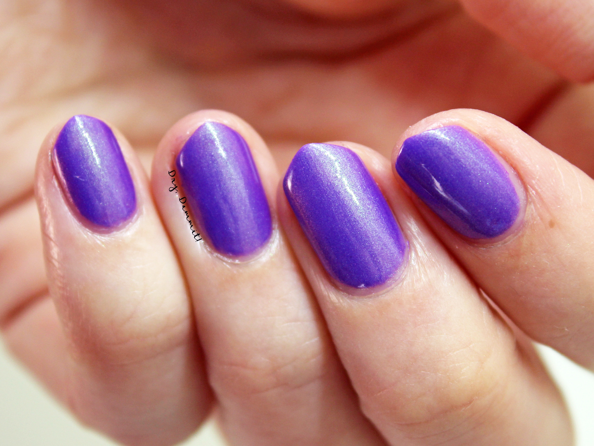
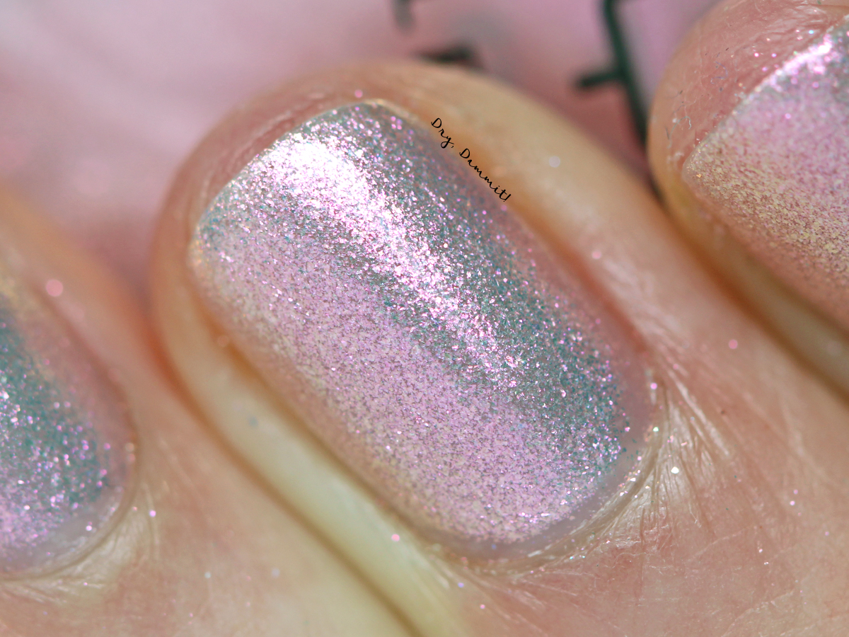
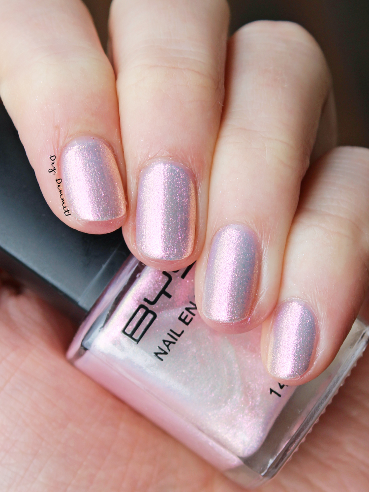
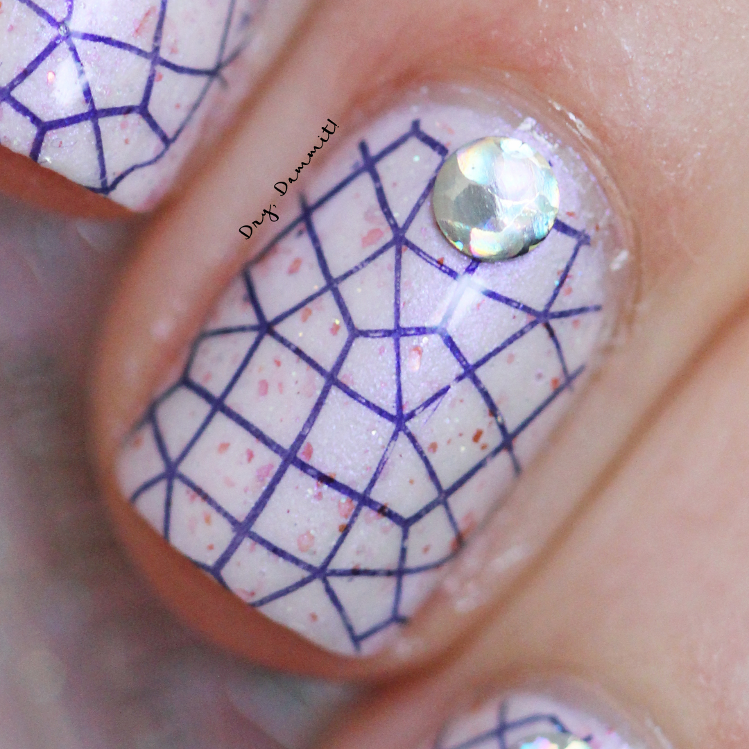
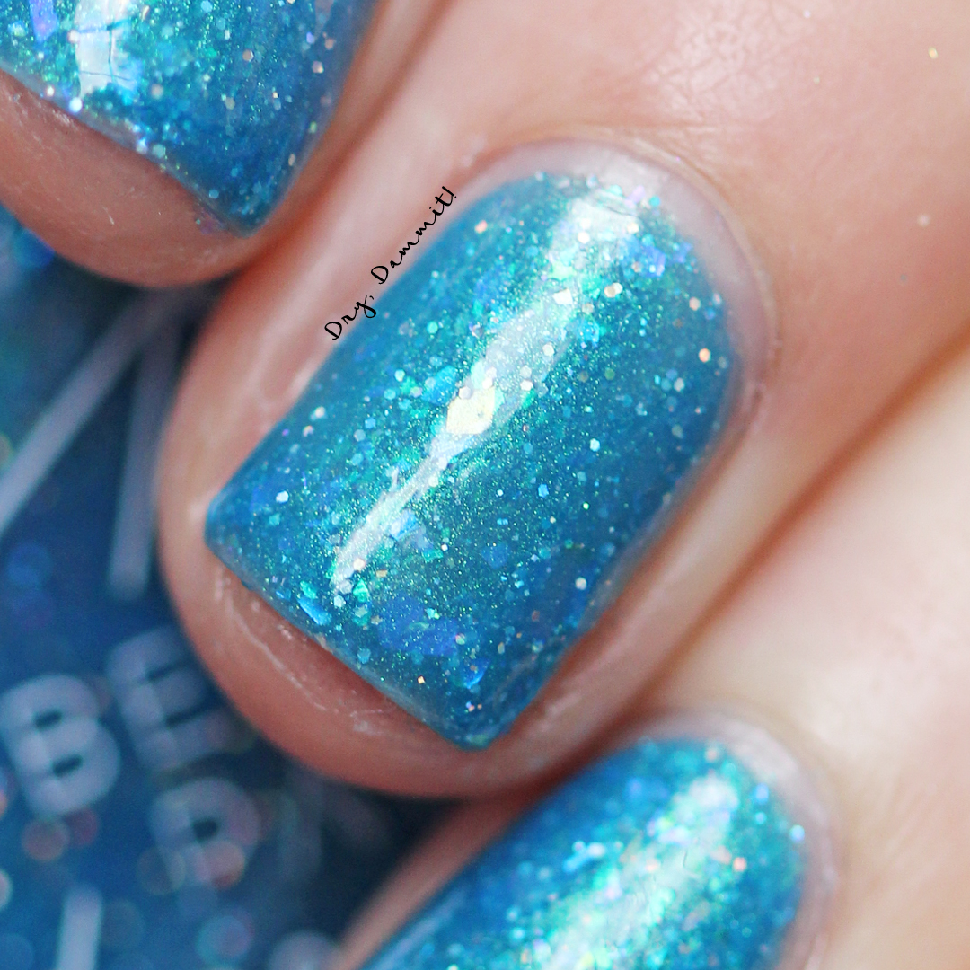 PSYCHE
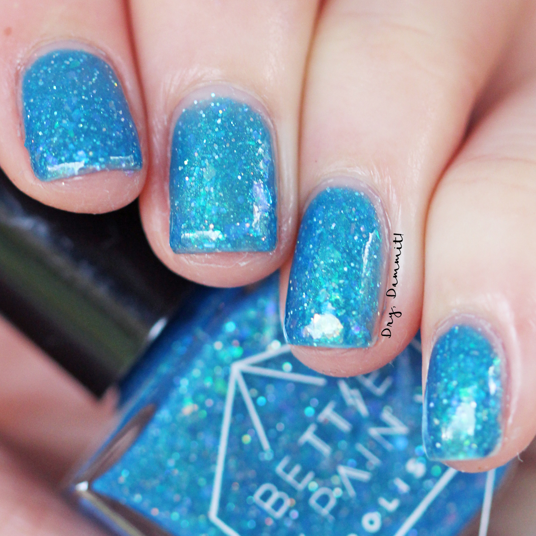
 EDEN
EDEN
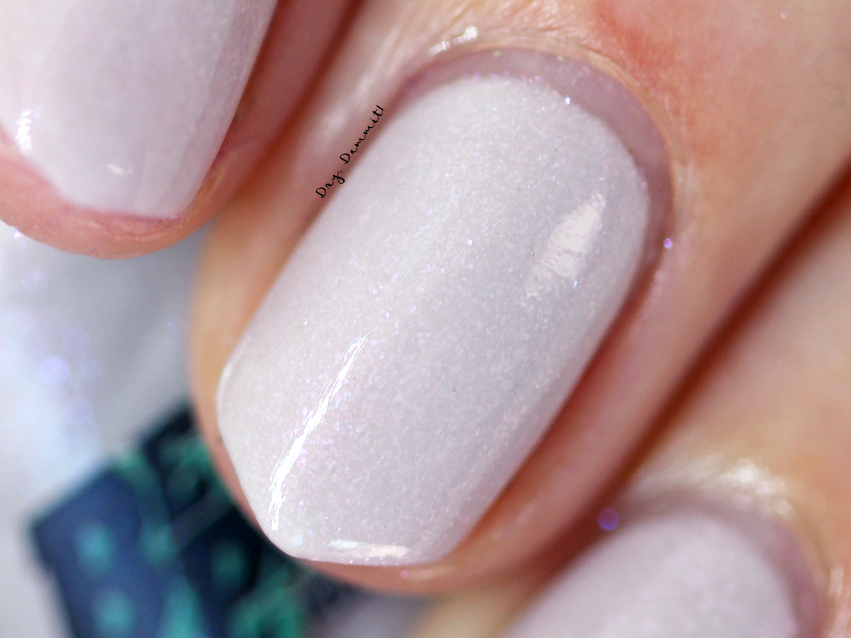
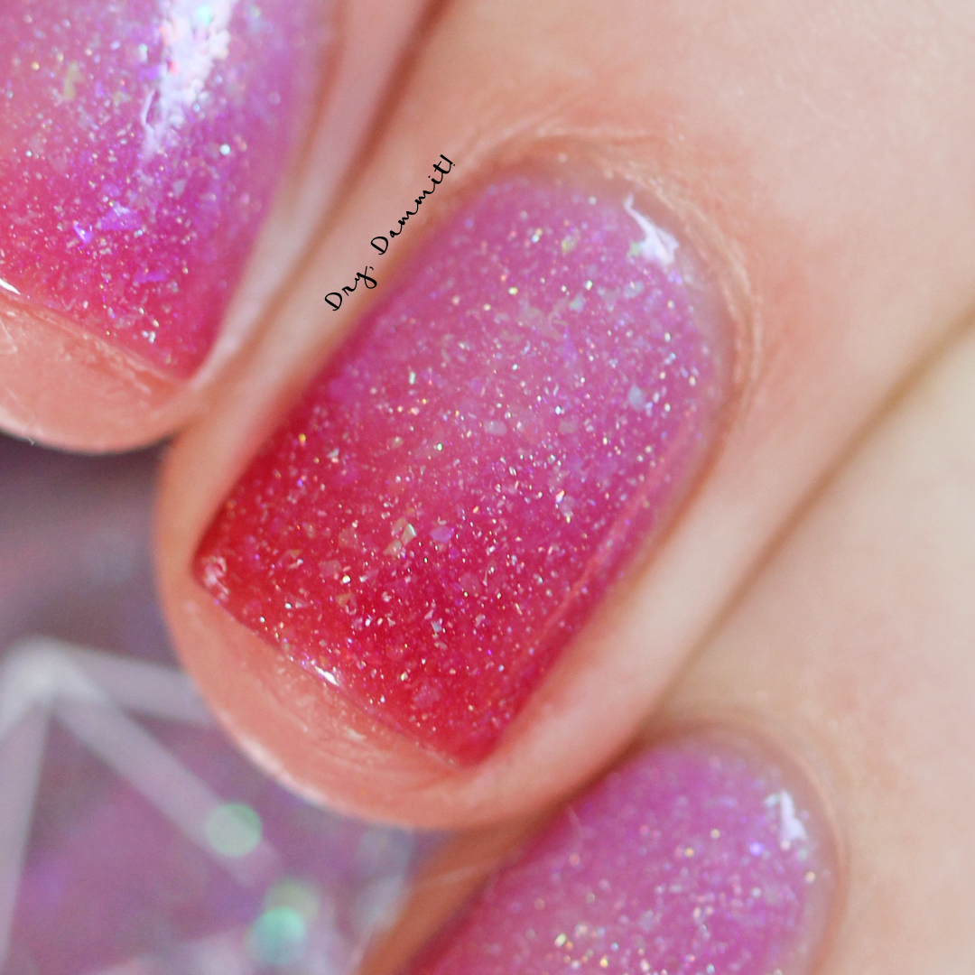
 Eden in its cold state
 Eden in its warm state
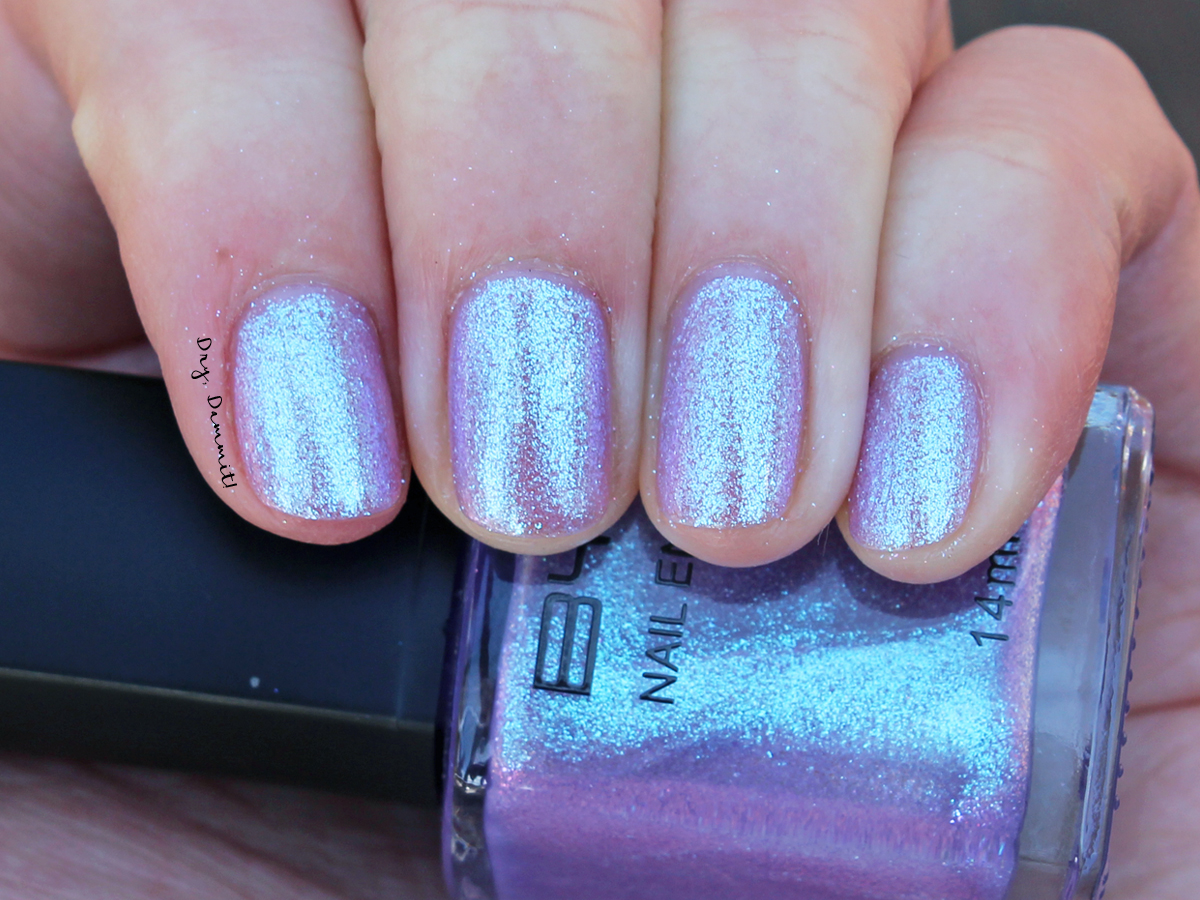
 TRANCE